When we really look at a streetscape what do we see? Do we see beauty which mindfully piques our interest and stimulates us to exist in a better way or are we flattened in boredom? Personally I have a problem with signs and think there are far too many of them. A small change will go a long way in fixing that though.
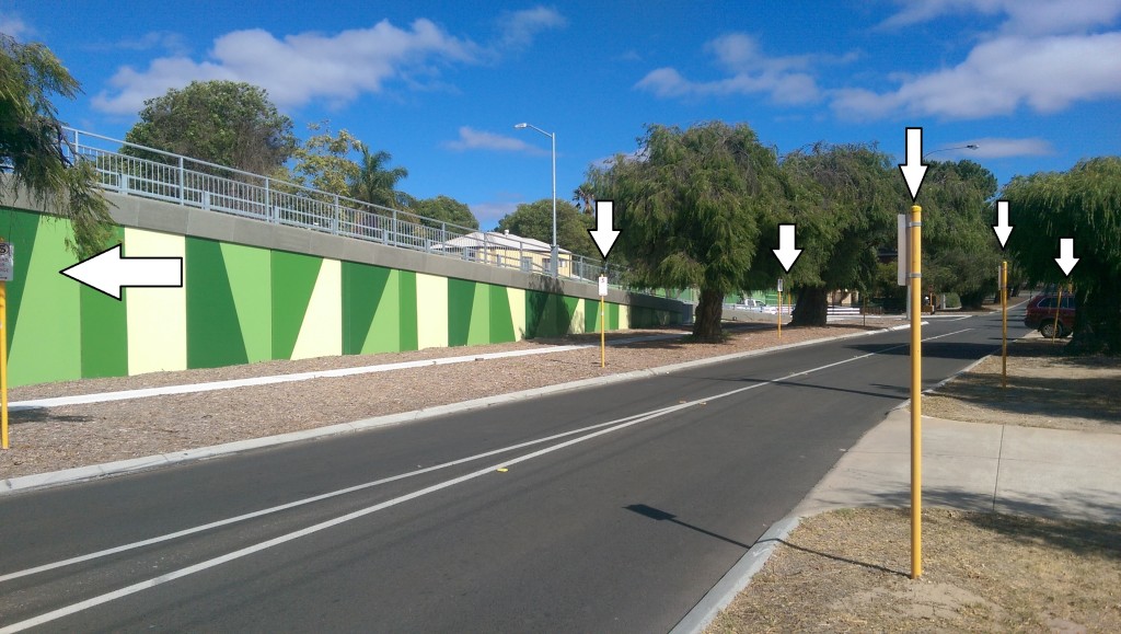
Drive down Railway Parade from Grand Promenade to the Maylands area and take note of all the No Parking or No Standing signs. The below picture on Seventh Ave, Maylands illustrates what I’m talking about:
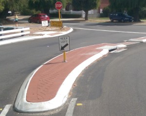
There is even a sign on the bridge reminding people to K eep Left. I guess this is in case someone driving over the expansive bridge gets confused and thinks they may be in the United States where they drive on the right hand side of the road. Peculiarly though, it’s not required to remind drivers they are still in Australia on the Maylands town site side of the bridge because there is no Keep Left sign there.
Most intersections along Grand Promenade have the below signs. Really, telling motorists not to park along Grand Prom is one thing, having to tell them not to stand at the intersection is a bit overboard. I’d suggest that if anyone thinks they can stand at the actual intersection then they shouldn’t have a driver’s licence. Ergo, why have the sign?
I believe a better, and probably cheaper, method of highlighting No Standing or No Parking areas is the use of yellow (no parking) and red (no standing) lines on the road. Much like this:

Streetscapes go to the very essence of amenity, and any reader of my blog will know that trees are a vital component, as are interesting verges, but they are not the only components. I believe taking down redundant signs will improve amenity.
What are your thoughts? And while your sharing them, can you please also let me know what this ‘Bus’ sign at Grand Prom is for, or why there is a rail sign pointing towards Milkd in Maylands?
Power to the people.
(Please be aware that these views are my own and have not been endorsed by the City of Bayswater.)


